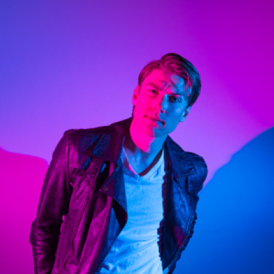
Use our Tailwind CSS Avatar component to portray people or objects in your web projects. The Avatar can be used as a visual identifier for a user profile on your website.
See below our beautiful Avatar example that you can use in your Tailwind CSS and React project. The example also comes in different styles and colors so you can adapt it easily to your needs.
The Avatar component comes with 3 different variants that you can change it using the variant prop.
The Avatar component comes with 6 different sizes that you can change it using the size prop.
You can add border around the avatar using the withBorder prop. To change the color of the avatar border use the color prop, by default it's blue.
You can use avatar with other components as well, see example below.
Tania Andrew
Web Developer
Tania Andrew
Web Developer
Tania Andrew
Web Developer


You can use the className prop to add custom styles to the Avatar component.
The following props are available for avatar component. These are the custom props that we've added for the avatar component and you can use all the other native img props as well.
| Attribute | Type | Description | Default |
|---|---|---|---|
variant | Variant | Change avatar variant | circular |
size | Size | Change avatar size | md |
color | Color | Change avatar border color | blue |
className | string | Add custom className for avatar | '' |
withBorder | boolean | Add 2px border around the avatar | false |
For TypeScript Only
import type { AvatarProps } from "@material-tailwind/react";type variant = "rounded" | "circular";type size = "xs" | "sm" | "md" | "lg" | "xl" | "xxl";type color =
| "white"
| "blue-gray"
| "gray"
| "brown"
| "deep-orange"
| "orange"
| "amber"
| "yellow"
| "lime"
| "light-green"
| "green"
| "teal"
| "cyan"
| "light-blue"
| "blue"
| "indigo"
| "deep-purple"
| "purple"
| "pink"
| "red";Learn how to customize the theme and styles for avatar component, the theme object for avatar component has three main objects:
A. The defaultProps object for setting up the default value for props of avatar component.
B. The valid object for customizing the valid values for avatar component props.
C. The styles object for customizing the theme and styles of avatar component.
You can customize the theme and styles of avatar component by adding Tailwind CSS classes as key paired values for objects.
interface AvatarStyleTypes {
  defaultProps: {
    variant: string;
    size: string;
    className: string;
    withBorder: boolean;
    color: string;
  };
  valid: {
    variants: string[];
    sizes: string[];
    colors: string[];
  };
  styles: {
    base: {
      initial: object;
      withBorder: object;
    };
    sizes: {
      xs: object;
      sm: object;
      md: object;
      lg: object;
      xl: object;
      xxl: object;
    };
    variants: {
      square: object;
      rounded: object;
      circular: object;
    };
    borderColor: object;
  };
}
For TypeScript Only
import type { AvatarStyleTypes } from "@material-tailwind/react";const theme = {
avatar: {
defaultProps: {
variant: "circular",
size: "md",
className: "",
withBorder: false,
color: "blue",
},
valid: {
variants: ["circular", "rounded", "square"],
sizes: ["xs", "sm", "md", "lg", "xl", "xxl"],
colors: [
"white",
"blue-gray",
"gray",
"brown",
"deep-orange",
"orange",
"amber",
"yellow",
"lime",
"light-green",
"green",
"teal",
"cyan",
"light-blue",
"blue",
"indigo",
"deep-purple",
"purple",
"pink",
"red",
],
},
styles: {
base: {
initial: {
display: "inline-block",
position: "relative",
objectFit: "object-cover",
objectPosition: "object-center",
},
withBorder: {
border: "border-2",
},
},
sizes: {
xs: {
width: "w-6",
height: "h-6",
borderRadius: "rounded-md",
},
sm: {
width: "w-9",
height: "h-9",
borderRadius: "rounded-md",
},
md: {
width: "w-12",
height: "h-12",
borderRadius: "rounded-lg",
},
lg: {
width: "w-[58px]",
height: "h-[58px]",
borderRadius: "rounded-lg",
},
xl: {
width: "w-[74px]",
height: "h-[74px]",
borderRadius: "rounded-xl",
},
xxl: {
width: "w-[110px]",
height: "h-[110px]",
borderRadius: "rounded-2xl",
},
},
variants: {
rounded: {},
square: {
borderRadius: "!rounded-none",
},
circular: {
borderRadius: "!rounded-full",
},
},
borderColor: {
white: {
borderColor: "border-white",
},
"blue-gray": {
borderColor: "border-blue-gray-500",
},
gray: {
borderColor: "border-gray-500",
},
brown: {
borderColor: "border-brown-500",
},
"deep-orange": {
borderColor: "border-deep-orange-500",
},
orange: {
borderColor: "border-orange-500",
},
amber: {
borderColor: "border-amber-500",
},
yellow: {
borderColor: "border-yellow-500",
},
lime: {
borderColor: "border-lime-500",
},
"light-green": {
borderColor: "border-light-green-500",
},
green: {
borderColor: "border-green-500",
},
teal: {
borderColor: "border-teal-500",
},
cyan: {
borderColor: "border-cyan-500",
},
"light-blue": {
borderColor: "border-light-blue-500",
},
blue: {
borderColor: "border-blue-500",
},
indigo: {
borderColor: "border-indigo-500",
},
"deep-purple": {
borderColor: "border-deep-purple-500",
},
purple: {
borderColor: "border-purple-500",
},
pink: {
borderColor: "border-pink-500",
},
red: {
borderColor: "border-red-500",
},
},
},
},
};